Harmony in Colours
An accidental discovery of the harmony in the colours of Nature.

Recently, I was exploring into the State of Art technologies for graphing. I wanted to plot the Gita statistics and was hoping to find a colour scheme perhaps like the peacock feather combination ue to the casual association with Krishna.
I am not a very colour conscious person.. The different colours seemed to exist in silos for me and when it comes to shopping, colours and choices, I am confused many a times. I did not seem to have a colour statement of my own.

I came across this palette ‘viridis’ during the graph programming and I felt a sudden flash of an ‘Aha’ moment. Slowly my past choices started unfolding one by one. Apparently the range of colours in this palette are so different yet blend so well. They are soft on the eyes and can generally be discerned by the colourblind.
It occurred to me suddenly that I have been enjoying these shades in the last 20 years and just now discovered the underlying palette. From the pastel blue-green- olive yellow flowers in the daily corelle dinner plates to the fine russian and french cutlery gifted by my parents..
From the Indigo coloured Rajasthani bedspreads to the myriad number of sarees and stoles to the blue kurtas of the boys..

From the olive green husk of the moong to its pastel yellow dal inside.. From the yellow of the lentil fry and the green topping in the chilli curry leaf seasoning.. It seemed to be present abundantly all over at home..
And why not.. It makes me feel these colours are the soft and abundant hues of the nature.. The infinite blue of the sky and the oceans and the brown yellow green tinge of the earth, leaves and the pulses.. Natures choice of palette is impeccable and comforting to the eye indeed..
And the special and the bright colours are reserved for the few occasions.. The rising sun, the blooming flowers, the colourful plumage of the birds and the redness of the lips. For a moment I am letting go of physics and Rayleigh Scattering and discounting that Red has the highest wavelength and hence can be seen at a distance due to less scattering..
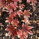
And the other palette of Nature I can think of is the gentle green- olive- rust transition of the fall leaves.

And why do each of us have a specific choice in colours? Perhaps it is entangled with our deep rooted nervous system, our physical nature and our past experiences. In the Chakra theory, there are major nerve crossings across the spine in 6 regions.
When white light enters our mind, it kind of splits into 7 colours across these points. The lower chakras are indicative of primitive functioning of the survival, procreation and have the red and orange association. The upper chakras have linking with enlightenment, creativity warmth, determination and have violet, blue, green, yellow associated.
So much food for thought and colour starting from thehumble graphing program.